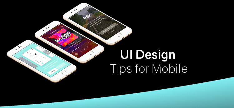
Top UI Design Tips for Mobile App Designers
A good UI is no longer an option for you as the mobile app designer; it is the first thing you need to look at when developing a mobile app. If your app takes 1 minute to load, and that of the competitor takes 30 seconds to load, the users are surely going to move towards the competitor’s app. Similarly, if your app requires the user to use their brain, and understand every information before processing ahead, then they might switch to another app that is more intuitive and easy for them.
If you are planning a mobile app, then the design should be friendly and in sync with their needs. Here are a few things that would help you optimize the user interface and make the design friendly for the user.
Start With Decluttering The Screen
We want to provide as much information as possible to the user in that small screen. However, the truth is, the user will leave your mobile app if you overwhelm with that amount of information. The complexity of the design and the complications in using the mobile app increase with the cluttered screen. The best way to battle it would be to avoid cluttered screens. Include information that you believe will enhance the usage of your app and lead to engagement. Remove unnecessary information that takes up a lot of space.
Even the buttons and other interface interaction elements should be built to the minimum for better usage. There is always a read more or show more button that can be included to detail out the information. Maintain white space as necessary throughout the screen.
Breakdown The Tasks
When you have everything on a small screen, it makes sense to break down the tasks and get users to complete the tasks faster. A number of subtasks to complete a single task is way easier and friendlier than getting a single task that is long and tedious.
Normally, you will see a step-by-step checkout planned for the mobile e-commerce app solutions. The first step is to add the details and confirm the cart, then add the address details, then make the payment and finally get the confirmation. The logical flow will improve the engagement, keep the user rooted to your app, and finally improve your conversions.
Make The App Look Familiar
It is important to place the user on familiar grounds, instead of making them guess along the app.t That’s why you should always use screens that look and feel familiar. For instance, what’s new, search results and login screens are normally present in every app. If you use them in your app, the user will apply their previous learning to use your app, thus reducing the app’s learning curve.
Keep The Forms Short And Easy
If you ask users to input the information on a small screen, then you might make the users leave your app as soon as they arrive on it. Apart from causing user attrition, long forms are also error prone. The best way to deal with it is to keep the forms short and easy. Here are a few tips that can make form filling on app easy and user friendly.
- Ask the users to fill in just the basic information, which you need to complete the task.
- Provide the user with input masks. This way they would know what they need to enter in the input field, and finally reduce the error
- Use the autocomplete features in order to smartly complete the tasks. You can use tools that allow you to complete the tasks automatically.
- Validate the field values while you are filling it so that the users are allowed to correct the fields while filling them out.
Keep The Design Consistent
It is important to keep the design consistent so that your user feels less confused while using your mobile app. Here are the elements that you need to keep consistent if you want to improve the mobile experience.
- Keep the app’s visual elements consistent. The choice of colors and typography plays an important role here. You may want to choose one or two at the most colors to design your mobile app. You can use colors that are used in your logo or, choose colors that are in sync with the colors in your logo. Use warm and pleasing colors to make sure the user feels good while visiting your app.
- The typography should be chosen such that the words are legible and the app content makes sense. You may want to keep the typography simple in your app. Make sure the typography elements are consistent throughout the app.
- The functional aspects of the app should be consistent. If you are using buttons in your app, make sure the buttons are similar across the app. Use the same color to define the buttons as well. Same goes for other functional aspects of the app.
- Apart from the app, the other digital assets of the brand should be designed in a similar way. For instance, the website or the other ventures should be designed in accordance with the brand principles to keep the simplicity of the design intact. The users can use their previous knowledge of the brand’s assets to use the mobile app or other digital assets.
- Make sure your mobile app is in line with the native operating system’s guidelines. For instance, you may want to design an iOS app similar to the Android app; however, the guidelines for both the platforms are different, and you may want to consider that before you design the app.
Handling Error Messages
This is an important consideration when designing the mobile app. You need to keep the error messages simple and easy to understand. A message such as “an error has occurred” or something as simple as this would help the user know that they have committed a mistake and try to correct it faster.
You need to mention, where and what went wrong. In some cases, you may evne have to mention why.
Accessible Interface
You may want to make the interface more accessible for all possibilities. Take into account color blindness, blindness and other aspects of accessibility into consideration when designing the mobile app. Most people cannot see the color changes or are unable to detect the color changes in the mobile app. If your app cannot handle these issues, your design can fail for these users.
The Navigation
It is important to keep the navigation as easy as you can. For instance, if the user wants to go back to the particular screen, from where they navigated to the current screen, the back button should be prominent. This will reduce the confusion and get the user to use the app with ease. The home button and other navigation buttons should be prominent on the screen. They should not think twice when making the choice to navigate; it should be intuitive. You should organize the structure in a way that the user can navigate to their screen in minimum taps and gestures. The navigation pattern should be simple and consistent.
Summing It Up
It is important to keep the animation simple and minimum. These are just some of the design aspects that you need to consider when developing a mobile app for a business. It is important you handle it from the user’s perspective. Design the app such that it can be easily handled by the users, keeping their usage patterns in mind.
Coruscate designs mobile apps for the user, keeping their usage behavior and other patterns in mind. We have successfully developed applications for a wide range of businesses in diverse industries. If you have an idea that you want to develop from the scratch, connect with us.
Our team will help you transform it into a workable app. If you just want to discuss more on mobile app designs or wish to know more about getting an idea up into a design, connect with us. Our experts would be more than happy to contact with you.
Related Blog


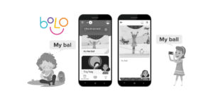
Bolo App Clone : A new advancement in education app development – Google launches a speech-based reading tutorial app ‘Bolo’
“Learning improves creativity, creativity leads to thinking, thinking gives us knowledge and knowledge makes you great.” To acquire this greatness, the world is putting technology to better use. Like every…